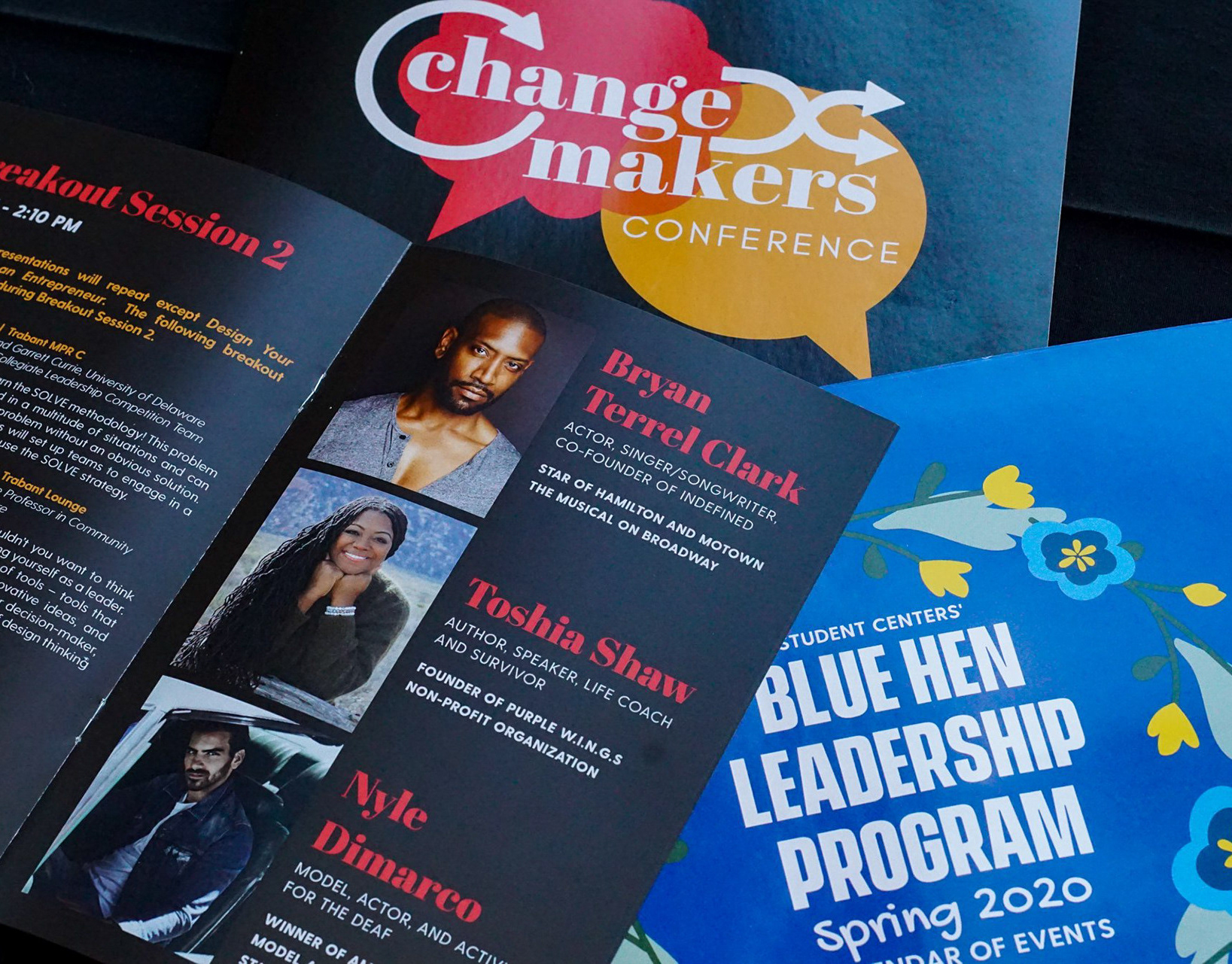
As the University of Delaware Student Center's student creative agency "The Egg"— inspired by our Blue Hen Mascot — began to take shape, a brochure was needed to help launch the new program. To summarize the new marketing agency's vision, "creative services for students, by students," the brochure had a two-fold purpose (pun intended).
Purpose one — The Egg first and foremost serves a vibrant community of 400+ student organizations, including fraternities and sororities, and assists with professional marketing and communications work for Student Life. Purpose two — the student marketing agency offers student employees and interns real-world professional development, preparing them for a career after college, while delivering experiential learning through a customized creative track curriculum provided through the Egg Academy.
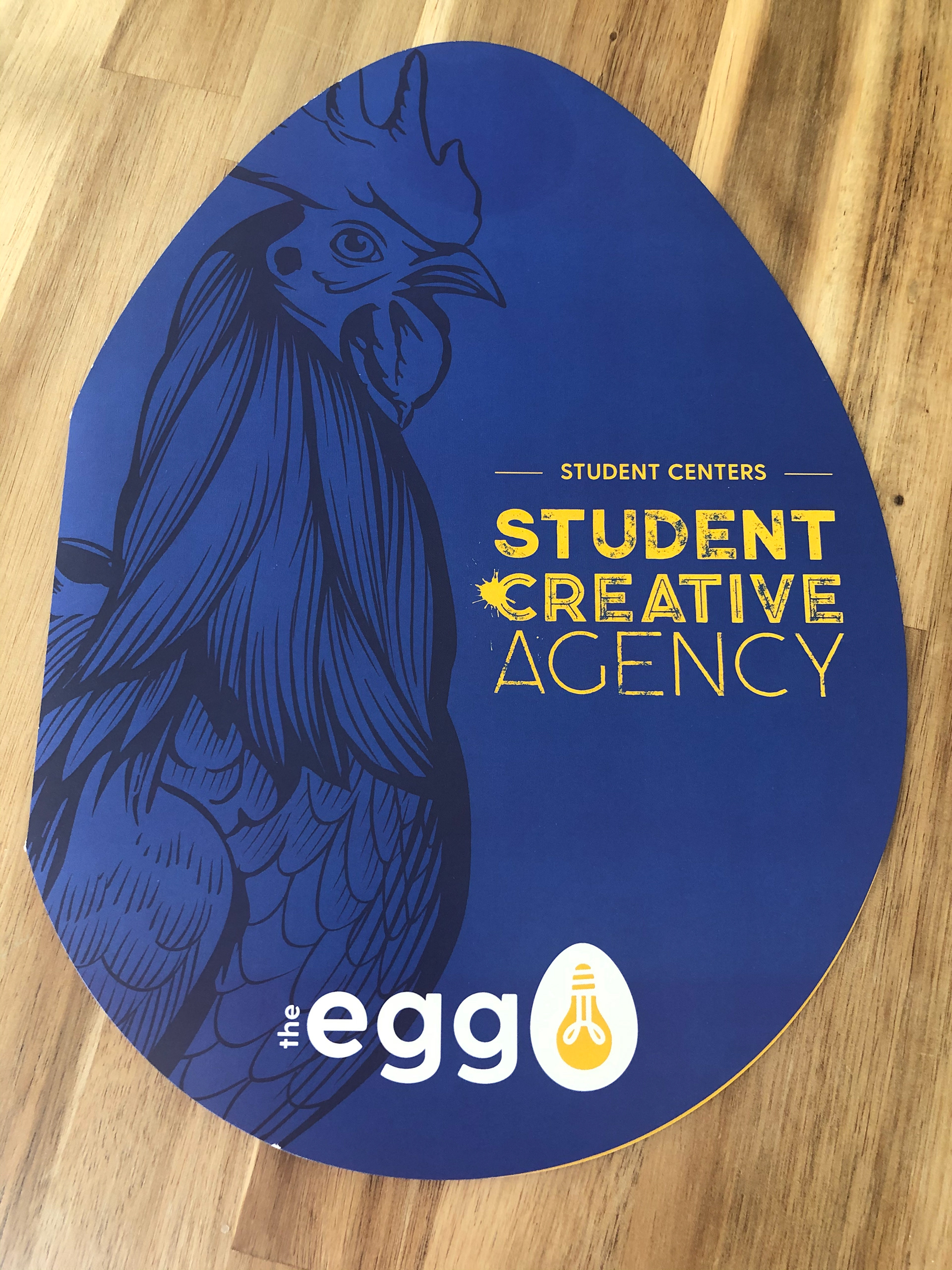
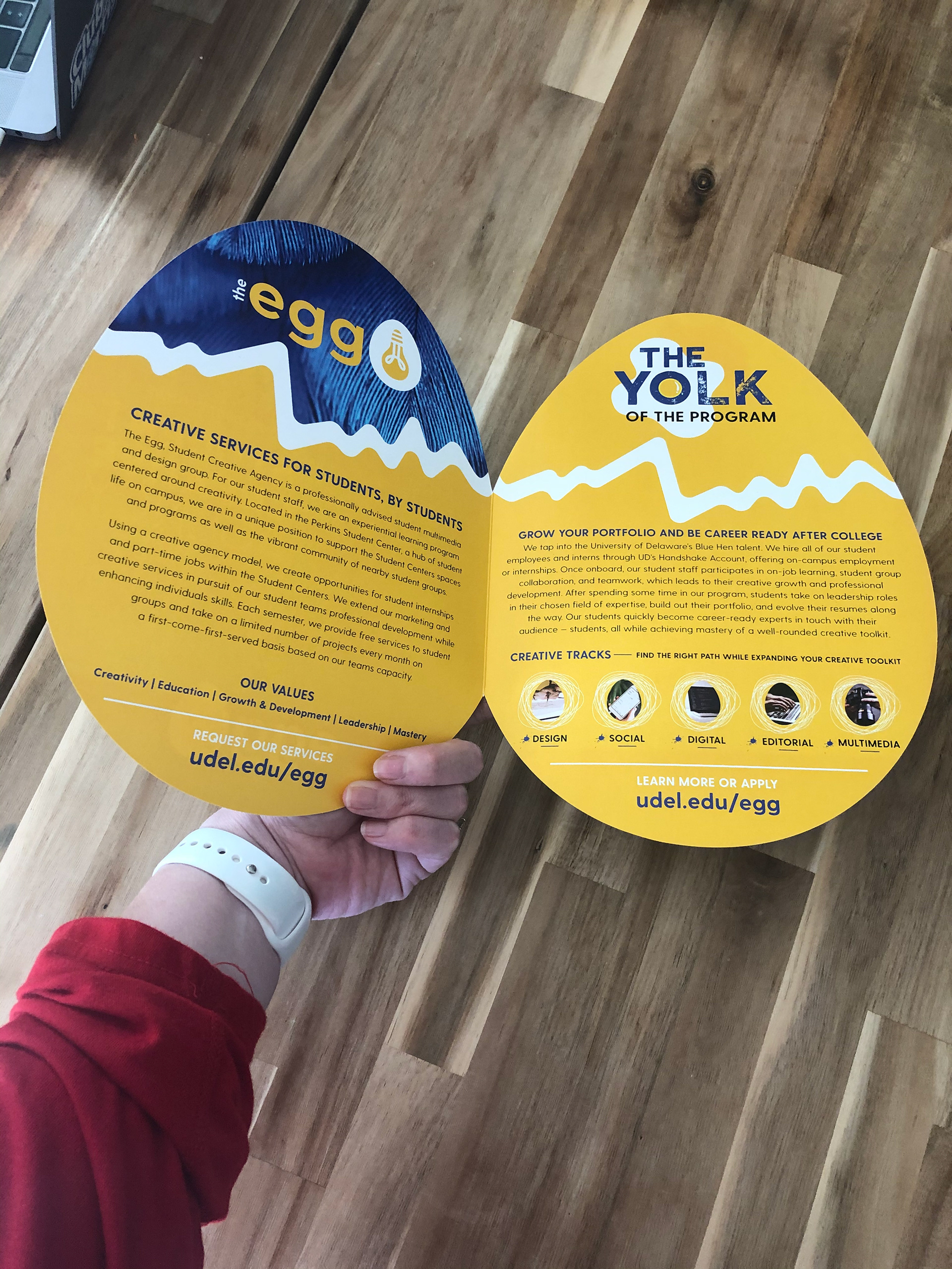
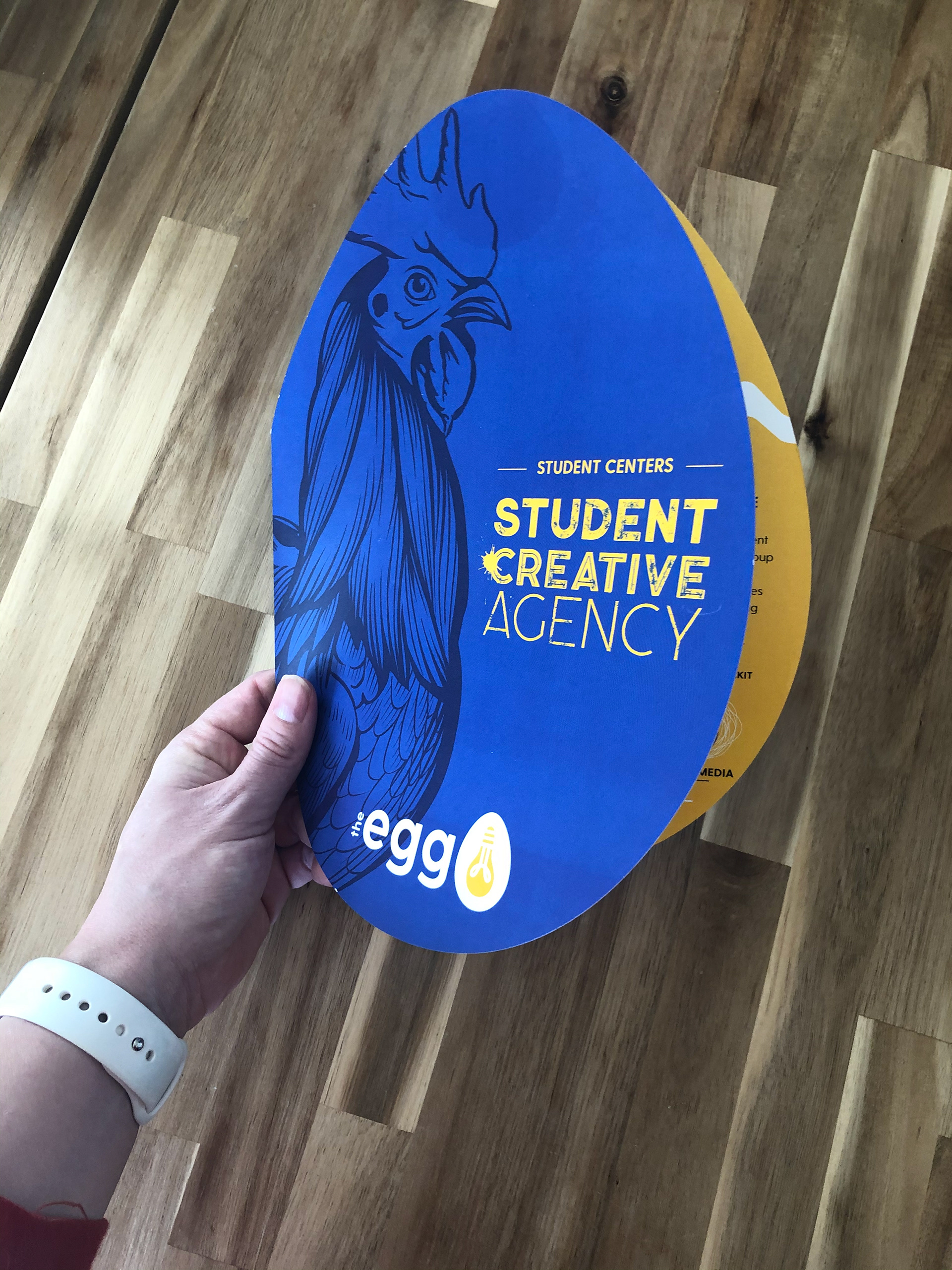
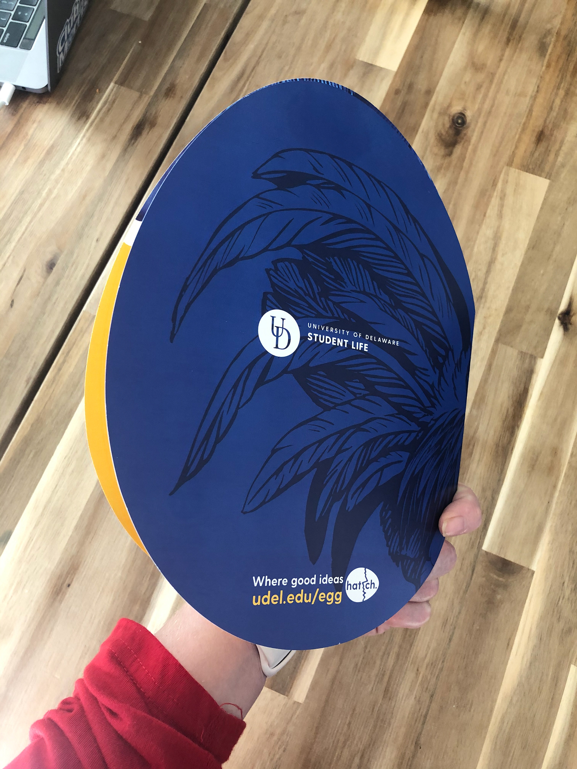
Naturally, the brochure's shape would be precisely that, an egg to show off the program's fun and creative aspects. The brochure was custom die-cut to achieve this shape. The cover boasts an illustrated Blue Hen. The back page has the program's tagline "where good ideas hatch," with a call to action pointing viewers to the program's website. Inside, the design plays on that tagline utilizing the hatch concept with a "crack" splitting the page. The first page describes the service offering. The second page, "the yolk of the program," explains the professional development offering and creative tracks — both pages inviting users to the same call to action The Egg website below.
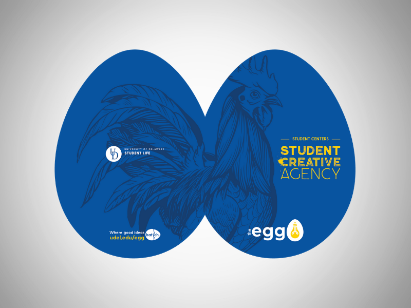
Egg Brochure Front and Back
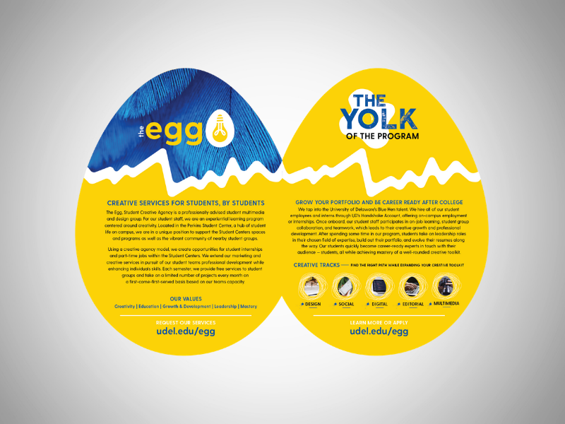
Egg Brochure Inside
Egg Brochure Featured at Involvement Fair. Student Employees Pictured: Kristine Lim (Left) and Emily Taylor (Right).
Video Of Emily Taylor Showing Off Egg Brochure.
